
(This post first appeared on EngineerDog.com)
In my previous post I shared an introduction to a cup-specific plotter project I developed over the last couple years. This time I want to dive a bit more deeply into appreciating some of the art you can produce with this type of machine.
This article has a good bit of detail and I don’t want to discourage someone looking for quick solutions or a casual hobby, so Ill mention upfront that there are many free tools available that allow you to easily use the techniques mentioned here to make cool art without sweating all the underlying details. But maybe this will inspire your curiosity to dig a little deeper and come up with some of your own.
…
Multiple well-meaning people have asked me how quickly the CylinDraw can pump out drawings, and if it can be made to automatically swap out cups & pens.1
The tool is quick for what it is, but thinking in terms of automation & cups per hour is not the best way to appraise its value & potential.
To them, a traditional pen plotter must seem like an odd choice of technology for me to choose to develop. In the world of printing tech, creating images on paper by tracing thousands of individual pen strokes cannot possibly compete with the efficiency and resolution of modern inkjet printers.
Even today’s architectural paper size “plotters” are in reality inkjet printers with a bigger frame. The traditional pen plotting process is antiquated for that purpose, so why develop a new hardware platform with it?
A pen plotter is fun to build & use, mesmerizing to watch, and there is something uniquely fun about pen-drawn art!
The pen drawn aesthetic has timeless appeal, in the same way that a handwritten letter is more enjoyable than an email or mass produced pamphlet. The information conveyed may be the same but the value is different. The efficiency of the process used to create the art has an inverse effect on how personal the result feels.
You wouldn’t judge a calligrapher primarily based on how many letters they can pump out per minute, because a more important aspect of appreciating their work is understanding the thought processes, skill, and effort that went into producing it.
…
Lets say I found an image online I like enough to decorate my cup with or print out and hang on my wall. This chiseled looking guy will do.

As you can see, this image is small but conveys a ton of detail. That’s because it is a matrix consisting of 180 by 215 individual pixels, each of which can be displayed on my computer monitor as a unique shade of gray. The digital image itself is a raster graphic which is great for displaying extreme color detail.
Now an interesting question,
How does an inkjet printer print in grayscale, using only black ink?
When I hit print on my office printer, my computer converts each pixel in that image into yet another smaller matrix of microscopic dots.
Each of those dots will be the target for aerosolized ink which is sprayed from row of tiny nozzles. (A good photo inkjet printer can print 1440 dots per inch).
On paper, the color of the image pixel is communicated by varying the density of those ultra tiny dots. Black is 100% dots, white is 0% dots, and gray is achieved via optical illusion (called dithering) by having some number in the middle.

The printing process is fundamentally different on a pen plotter. The tip of my pen is a single point 0.1-0.5mm wide, too large to reproduce a gray looking pixel with that method. The plotter armed with a single pen can only draw a large black dot or nothing at all, with no option in between.
A raster graphic is not directly usable.
To accommodate a plotter that uses a single pen what we need is a black & white vector graphic, a discrete mathematically defined image consisting of explicit curves readily parsable to derive the complex paths the plotter will need to follow.

But how do you convert a raster image into an equivalent vector graphic?
That’s part of the fun, there’s no precise ‘equivalent‘ way to do it, only endlessly different artistic interpretations.
To get started on any sort of vectorization we have to consolidate the number of colors in the image down to the number of ink pens that we will use. In this case just black & white for a single pen.
This is a core challenge of converting image types. Where a raster might have many shades of gray that merely imply an edge and let your imagination complete the unspecified feature, a rigorously black or white vector is less forgiving.
The simplest way to consolidate colors is a method called ‘thresholding’. You pick some threshold gray value, then convert every pixel in the image into completely black or white depending on which side of the threshold it falls on. Shown here as a screenshot in the CylinDraw DePixelizer program.
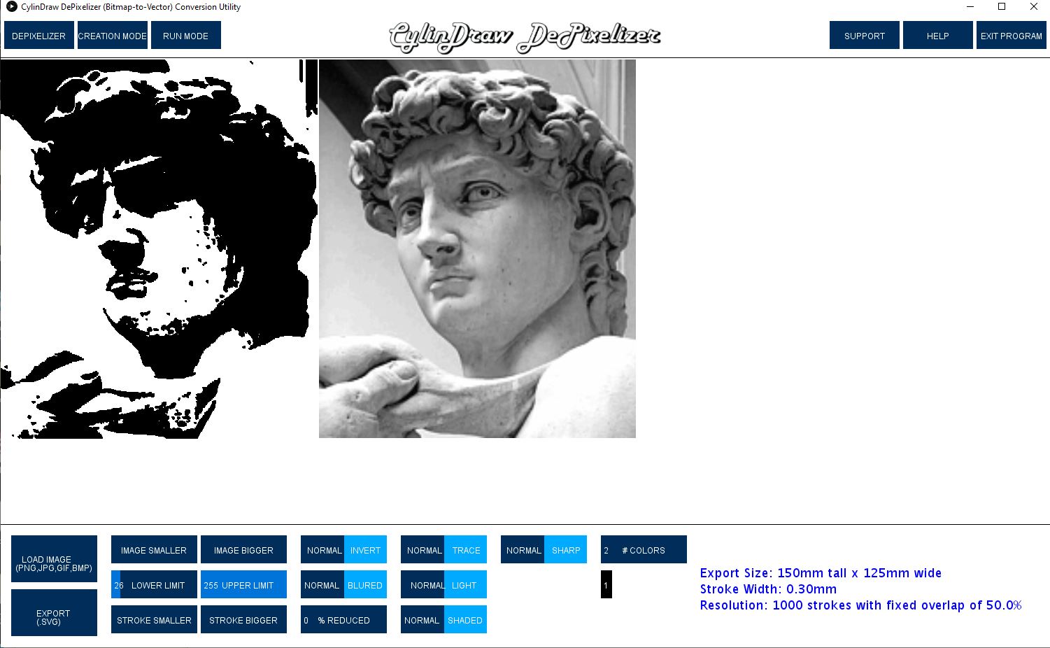
I adjusted the threshold value carefully, but you can see the image lost a lot of detail, especially around the eyes and hair.
We can attempt to get some of that detail back by applying a matrix filter, or what is essentially a strategically weighted average of pixels in a small area, applied over and over again.
The filter (or kernel) is the criteria for how the average is weighted and even small changes to it can have drastic effects on the result. (There are some great step by step images walking through this process at this link, but the core idea and math behind it is easier than first sounds.)
The effect of edge detection, sharpening, & embossing filters for example, is to emphasize the comparative difference between a given pixel and its nearest neighbors to make boundaries stand out. The examples below are still only black and white pixels but they show much more detail than before.


Another interesting color consolidation method is called stippling, or basically dithering on a larger scale. Just like the example shown earlier with red & blue squares appearing to blend together to make purple, except instead of dithering on a sub-pixel scale to produce a gray pixel, you dither together groups of pixels into consolidated larger dots to make the group appear gray in aggregate.
One way this technique is carried out is by performing a basic threshold on every pixel as before, except while doing so keep track of how much you’ve cumulatively rounded the pixels so far and apply that error as a bias going forward. So if you round a gray pixel toward black, it becomes more likely that the next gray pixel is rounded toward white. This keeps the overall rounding error low which preserves the intended effect of the shades of gray. Incredibly this image is nothing but black & white dots:

Those methods are widely used but there are examples of more esoteric methods and task specific tools that creative people have shared online for free. Here’s a couple I just made with ‘SquiggleCam’ & ‘Spiral Raster’ tools, both vary the amplitude of a wave based on the pixel darkness of a local matrix. I assume they did it that way to make the job faster by eliminating the need to lift the pen.

We can also do some neat stuff if we remove the black/white limitation & allow for drawing with a few more colors. Because we can easily program the plotter to sequentially draw each color on the same job.
The only real limitation to drawing in color is having enough uniquely colored pens and our ability to determine how to properly consolidate the pixels into a select few colors (a process called “color quantization”).
My software uses a Red/Green/Blue color model, which means that every possible color displayable on my screen can be quantified as some combination of those three colors. With a 3 category mix, the linear white to black scale we used for thresholding won’t work.
The question becomes, how do I compare the similarity of 2 colors on a 3 color scale? (i.e. Is that brown pixel more reddish green or bluish red or greenish blue?)
The trick is to use a tiny bit of trigonometry. We just pretend that Red, Green, & Blue constitute 3 perpendicular axes in space, then any color can be assigned a position in space based on its RGB components. From there any two colors can easily be compared using the distance formula, and voila we can figure out what parts of Obamas face are the most reddish green.
In this example I’ve used a sharpening filter & allowed 1 shade of gray on David. (This is what I ended up drawing on a cup). For an example that has more colors to begin with I tried to recreate the effect of the famous color reduced Obama campaign picture.

Up to this point I’ve shared some neat algorithms for conveying detail with a reduced color pallet, but to draw the image we still have to convert those pixels into mathematical paths the plotter can follow.
One of the most powerful & commonly used vectorization strategies is called contour tracing. A program checks every single pixel in the image and tries to logically connect the edge pixels into lines, then define & name the enclosed areas.
This link has some great contour tracing algorithm animations which make the process conceptually easy to understand..

The rendering above was made using the default settings Inkscape. Edge tracing is a common capability since there are many ‘unique’ tools online that trace images for you, or so it would seem…
To the best of my knowledge the vast majority of edge tracing vectorization programs delegate the actual tracing task to one specific open source program, Potrace. Manually creating a good edge tracing algorithm yourself is quite difficult because of the nuance & complexity of keeping track of which lines should be combined to form enclosed spaces.

(img source: https://xkcd.com/2347/)
One problem with using the Potrace vectorizer for plotting is that the result does not take into account the size of your pen stroke.
A scalable vector graphic (SVG) by design can be scaled to any size and the paths will remain proportionally unchanged. So if I take a Potrace SVG and have my plotter draw it scaled onto paper at 2″ tall and then again at 20″ tall, the effect of the constant pen tip diameter will be significantly different.
All the perimeters on the smaller drawing will be thicker, possibly to the extent that they occlude the areas enclosed by them. I call this the narrow path problem. Its easily visualized by signing your name with a fine tip pencil, then tracing the signature with a thick sharpie.

For my DePixelizer software I came up with something original to solve this problem. Basically I rescale the raster image until one pen dot = one pixel so I can work at a 1:1 scale.
My program requires you to specify the desired physically drawn image size along with the pen stroke diameter. With that information I calculate the maximum number of pen diameters the image will be in width & height. This is the maximum resolution the pen is physically capable of achieving without overlapping strokes. (I squeeze a tiny bit more resolution out of the pen by allowing drawn strokes to overlap by 50%.)
What’s nice is that I don’t have to worry about defining edges & filled areas, I’m converting directly into readily usable dots that are located at the finest achievable positions.
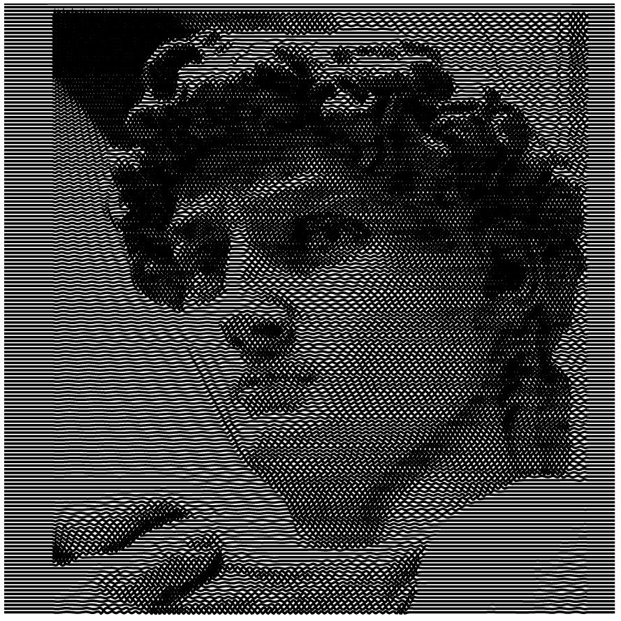
Here you can see what a zoomed in screenshot of the corner of the CylinDraw logo. The first picture is a raw raster showing gray pixels everywhere around the edges. The second pic is cleaned with a threshold, and the third has a dithered edge trying to simulate those gray pixels. The dithering looks less desirable when vectorizing words, but the same effect looked much cooler when drawing David’s head earlier.


The tricky part is creating clean multicolor vectors.
Consolidating raster images into 3 or more non-white colors will produce errant dots that have to be filtered out. Thus the program was named after the primary challenge of improving it, “DePixelizer”.
Something more complex than a basic threshold filter is necessary. I use color quantization & sort by nearest match, but its really hard to correctly classify unsaturated gray pixels that have equal amounts of red, green, and blue content!
One method I use to reduce noise is to consolidate consecutive dots of the same color into lines, then remove any remaining lone dots because they were most likely noise and take longer to draw anyway. It works well for most scales but it starts breaking down as you continue to use larger markers & smaller output images.
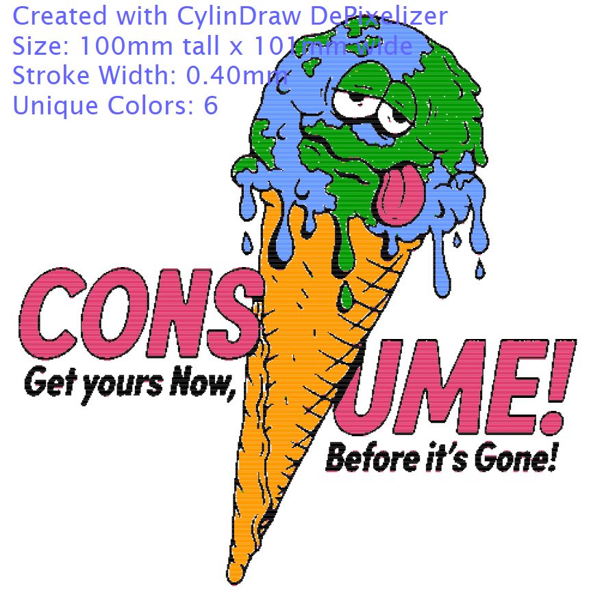
In the ‘earth ice cream’ example below you can see only a little bit of noise with a 0.4mm stroke on an 100mm tall image, imperceptible when drawn. But with an absurdly thick 2mm stroke its a mess because the pen resolution is only 100 strokes tall and the raster had to be blurred to resize it. This is approximately the best you can do with that pen at that size output.
In any case, the DePixelizer tool is great for creating derivative artwork and enabling people with a simple vision to carry it out quickly & easily.


Ironically, my favorite kind of plotter art is a type that beyond my current ability to produce.
This article has been about challenges of converting image types to make creative interpretations of existing images. But many folks create algorithms to generate vector images from scratch, called ‘generative art.’ There is some amazing new stuff out there pretty much daily if you follow the hashtag #plottertwitter.
That’s all for now, next time I’ll be sharing some cool algorithms involving path optimization.
…
Thirsty for more? Drink from the fire hose! Here are some excellent resources on these topics:
https://drawingbots.net/knowledge/tools Actively manage collection of the best plotter resources
Whitepaper on Creative Plotting Workflows.
Drawing images with dots, computational stippling on Wolfram Alpha Blog
https://pixelparmesan.com/dithering-for-pixel-artists/ various dithering strategies
http://vector-conversions.com/vectorizing/raster_vs_vector.html Deeper dive raster vs vector
https://en.wikipedia.org/wiki/Color_quantization Color consolidation strategies
https://revdancatt.com/2021/02/05/a-short-essay-on-pricing-pen-plotter-art
Statue of David image source: https://en.wikipedia.org/wiki/Dither
Melting earth image source https://www.reddit.com/r/Art/comments/ofpy94/ice_cream_me_digital_2021/
- Performance notes from beginning. CylinDraw cannot and will never automatically switch out cups for you. It does manage the timing & order of pen swaps but it merely pauses the job & beeps prompting you to switch the pen. For the task of engraving, cups-per-hour is a more relevant metric since the output is indistinguishable from the alternative tech; the full process throughput is probably half the speed of a good rotary laser engraver.
- The finished work:

